Independent Research #6: Texturing My Original Trim Sheet (Final Part)
- Rachel Molnar
- Oct 23, 2025
- 4 min read

Welcome to my 6th post, and the final part of my Trim Sheet project!
In the previous three posts, I have attempted to design, model, and texture my own trim sheet. In the last post, I addressed some issues I had when trying to begin that texturing process, and how it ultimately led to the reimagining of my entire trim sheet. Here is the finished 3D model that I posted in my last blog post:

As a student at Clark University, one requirement for the Interactive Media Design degree is to participate in a Studio. This is a two-semester course where you collaborate with peers to create a game.
That's why this trim sheet is intended for use in the game I'm currently developing: Singularity. The game's atmosphere is an abandoned, yet intact, space station. As you play as a robot who wakes up, you search for evidence that time has passed and the station is deserted, wondering where all the humans went, and ultimately discover your purpose..
For the texturing process, I focused on creating a design that captured a sense of age and abandonment but retained a realistic, slightly stylized aesthetic. Split Fiction has been a major inspiration, particularly their space levels. I admire how they use a bright color palette to draw the eye while successfully conveying the environment's grime and deterioration.

For reference when it came to texturing my trim sheet, I referred to Blender Bro's trim sheet tutorial on YouTube—a video that has guided me throughout this whole process. I found that their trim sheet provided a perfect blend of interesting, non-symmetrical details and an appealing color palette that was interesting but not overwhelming.

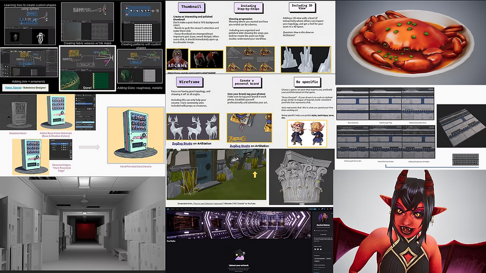
The first step in my texturing process was baking, and I kept my fingers crossed that I wouldn't encounter the issues I had before. As I have mentioned previously, the term "baking" refers to the projection of modeled details onto a solid plane, which gives the appearance of complex detail without requiring the actual geometry. This process provides my base for texturing. Here are those baking render results:

My next step was to lay out my base colors. Since this asset will be used in my Studio project, our project leader provided me with a specific color palette to follow. This limited the number of different colors I could use, which required me to get creative and strategic with how I would deploy each one—especially all the different shades of grey.

After I experimented with the base coloring of my trim sheet, I began to texture the rest of the asset by adding color variation using a grunge map. I also hand-painted some smaller details that I felt the smart materials weren't quite capturing. Once these details were established, I added a light generator to cast shadows on the "geometry" (which, as a reminder, we simulated on a plane using baking). This step gave the trim sheet more realistic shading and drop shadows.


I'm overall really pleased with how my trim sheet turned out. I think it perfectly reflects my goal of creating a realistic texture with stylistic colors and contrast.
Throughout my reimagining, remodeling, and texturing process, I definitely realized that, in some cases, less is more. By leaving ample open space within the panels, I've given myself room to later add decals, stickers, and other unique variations to break up modularity when creating a scene.
Speaking of which... let's put this trim sheet to work!

As you can see, I created a very simple, low-poly hallway module. I learned through the Blender Bro's trim sheet tutorial that by creating edge loops, I could then select individual faces, unwrap them on a UV map, and then adjust their size and position relative to the detail I wanted them to display.

I like how this unwrapping process challenges the conventional way we think about UV maps. In other situations, we wouldn't let a UV map hang off the edge of the texture, as shown in the above photo. However, since the texture is horizontally tiled, there is no cut-off. I repeated this "Face Isolation --> Unwrapping --> Adjusting position" process until I had fully textured my module, adding the imported textures I created for the light.
Thanks to Ryan King Art's amazing and helpful tutorial on setting up texture maps in Blender, I learned how to correctly import my textures from Substance Painter—a process I had previously only practiced in Unreal Engine and never done correctly in Blender. It made such a difference with my model once everything was connected correctly! I didn't realize that the Base Color node is the only parameter that should be set to sRGB, and that I needed to change the rest to "Non-Color".

I would have liked to create a texture for the floor, but since my main focus for this project was to create a horizontally tile-able wall texture, I'll continue with that goal on my own. For the purpose of this post, I will show you what I was able to achieve using just my Trim Sheet (and the light texture).


This concludes my trim sheet independent study! I am very pleased with how this exercise turned out, and I'm excited to add a floor texture to this in my spare time. Thank you for following along with this journey!
For the next post, I want to explore Blender's core functions and tools. I have been modeling in Blender for the past couple of years, but I've always meant to take the time to learn how to use things like "Lattices" and "Metaballs." There are also a ton of nifty shortcut key binds that I would love to discover because I believe getting back to the basics will make me a better 3D artist.
That's all for now—until next time!


Comments