Building My 3D Art Portfolio: Blog Post #4 - "Textured"
- Rachel Molnar
- Mar 15
- 5 min read

Welcome back to my blog series featuring my stylized crab project! After finally completing the base model and feeling satisfied with the results, it was time to move on to texturing.
As a reminder, here is the reference image I am using for this project:

As I mentioned in previous posts, I had already attempted to bring my model into Substance Painter for texturing. However, I eventually decided to go back and make changes to the low-poly mesh and even re-sculpt certain assets. Truth be told, before I made that call, I had actually already begun the texturing process on the original version of the crab.

Not only was I hitting display issues with my bakes, normal maps, and ambient occlusion, but the moment I started texturing, the proportional errors became impossible to ignore. For instance, the eyes looked way too oversized, and the connection between the claw and the arm lacked the structure it needed. These realizations are what pushed me to do the remodeling I mentioned in my last post, allowing me to finally start fresh with a clean low-poly model and better baking results.

While I have little to no experience with stylized texturing, I do have plenty of experience with 2D illustration in Procreate. Drawing on that background, I knew that I fundamentally needed to focus on my layers and colors. Because I was having so many issues with my Normal and Ambient Occlusion (AO) maps, I decided to delete them for this project. This allowed me to paint the shadows and highlights exactly where I wanted them, supporting my goal of making the model look almost identical to the reference image.
After some quick research, I found mixed opinions on this strategy. Some artists argue that including these maps is more convenient for quickly displaying details and variation. However, others suggest they aren't strictly necessary, especially if, like me, you are trying to maintain complete control over how the model reacts to light.
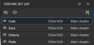
I ended up separating my model into four distinct materials: one for the onion, one for the plate, one for the crab, and one for the eyes. While this level of material separation isn't optimal for game implementation, it seemed as though it would have served my goals for this project. Since I intended to showcase the piece as a high-quality render rather than an in-game asset, I prioritized the ease of isolating my materials for stylized practice. Looking back, I probably could have achieved a similar result using folders within a single material. I think I initially defaulted to this setup while troubleshooting my previous AO and normal map baking issues, and once I found a workflow that worked, I simply stuck with it!
Before I began painting, I decided to do some brief research into stylized painting strategies. I found a really helpful video by Stylized Station on YouTube that discusses the mental process behind designing stylized pieces. The creator explained how they choose extra details (like arrows and shields) and how they focus on color variation, highlights, and breaking up solid lines. They also emphasized the importance of constantly zooming in and out to add detail effectively.
Abe Leal 3D on YouTube also shared a helpful video on creating stylized textures using various maps to build Smart Materials. While I decided not to use that specific workflow for this project, the insights were invaluable. He suggests that when color-picking for shadows or alternative hues, you should ensure each color stays relatively close to the mid-tone (the base color). This ensures the palette remains cohesive so that no single color sticks out too dramatically.
Next, I selected soft highlight colors for all materials and used the "Basic Soft" brush in Substance Painter to apply them. This brush became my primary/favorite tool for the project. By manipulating its opacity and flow and combining it with the blur tool and various generators, I was able to replicate the gentle gradients from the reference.

For the majority of the texturing, I relied on the "Basic Soft" brush in Substance Painter. By carefully adjusting the opacity and flow, I was able to build up the colors gradually, much like I would in a digital painting. I also leaned heavily on the blur tool and various generators to soften transitions, allowing me to replicate the smooth, painterly gradients seen in the original reference.

Next, I sampled the darker, saturated tones from the reference photo to paint in the shadows for each material. It was incredibly exciting to see the model finally begin to "pop" as the added color variation gave the crab a sense of weight and dimension.

With the high and low values established, I began layering in the finer details from the reference photo. I focused on the specific shapes of the shell highlights, subtle reflections, and both blurred and sharp edge highlights. I even added the small dots scattered across the shell, similar to the details I noticed in the reference photo.
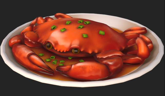
I'm really happy with how the texturing process turned out! It truly feels like I had captured the essence of the original reference photo. After sharing the progress with my classmates, I received some excellent feedback: the plate was too low-poly. Looking at it closely, the vertices were quite noticeable, making the edge appear jagged rather than perfectly circular. I quickly addressed this by adding more edge loops, and I have to agree that the extra geometry makes a world of difference!

Naturally, my textures looked one way in Substance Painter and another in Blender, but I am still incredibly satisfied with how this practice turned out. Given that I don’t have much experience with stylized art, I think the model and textures came out great. While I feel inspired by the videos I mentioned to try using layers and generators for a more efficient workflow next time, this project was a joy because it felt so similar to traditional or 2D digital painting. Mixing my 2D background with a 3D workflow was a fantastic experience!
I’m still a little unsatisfied with the area where the front claws meet the shell. Now that everything is painted, that transition between claw and base shell stands out to me and doesn't quite match the reference. Despite that small detail, I had a lot of fun bringing this character to life.
For my next post, I’ll be shifting my focus to preparing the model for its big debut and drafting my very first post on ArtStation! I hope you’ve all enjoyed following this process so far, and I can’t wait to share the final results with you.


Comments