Building My 3D Art Portfolio: Blog Post #10 - Character Project (Texturing)
- Rachel Molnar
- May 3
- 5 min read

Welcome back to my blog!
In my last post, I discussed the concepting, sculpting, and modeling process for my stylized character. Now, it’s time to dive into the texturing phase!

Before I could begin, I had to establish the specific texturing style I wanted to replicate. Since my model is stylized, I looked to modern media for inspiration; one of my biggest influences was Arcane. I love how the artists at Riot shade their characters' faces, using a mix of hard strokes blended together. I was particularly inspired by the blocky, distinct shapes of the noses and eye bags, and I wanted to replicate that look in my own model.

I started by blocking out base colors for each section of the mesh. I experimented quite a bit with my design choices along the way; for example, the trim initially started as silver, but I switched it to gold because the warm tone complemented the red accents much better.

SKIN
To texture the skin, I used a hard brush with a low flow to create deliberate, visible brush strokes and add manual shadows. I then took a darker red to layer deeper shadows where I felt the contrast would be strongest. I kept the strokes brush-like to match that Arcane aesthetic. Next, I took a soft, vibrant orange and lightly brushed over the spots that would catch the most light. Since I was texturing with symmetry on, I envisioned a light source pointing straight down at the model.

After achieving the shading contrast I wanted, I added small specks of detail around the skin to give the imp a "freckled" look. Finally, I used a brighter color to emphasize highlights, such as above the upper lip and in the crevices of the eyes.

OPACITY
Instead of modeling individual wings, I decided to practice texturing them entirely to push my stylized-texturing skills. I added an opacity mask at the base of my layer stack and outlined the wing shape directly on the mesh.

CLOTHES
For the clothes, I wanted to give the fabric a flexible, mesh-like appearance. I found a material that tiled nicely and set it to -100 to achieve that subtle, cross-hatched look.
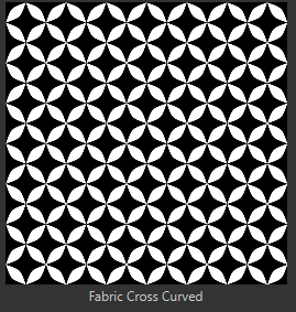
I think the way the fabric stretched (larger around the chest and tighter in other areas) was due to my UVs (which I won’t be showing as they are not as optimal as I would have hoped...). Regardless, I actually like how it turned out; it makes sense that the material would stretch differently in those areas, and because the costume has so much trim, it looks intentional.

I used a soft gray brush to accentuate the character's physique and emphasize the tightness of the costume. I also added brush-stroke highlights on the chest, anticipating the fabric seams I planned to add later.

To finalize the stylized look, I added hard outlines. While I initially chose black for this color, I’ve learned from 2D drawing that a solid black outline can often look flat. Instead, I chose a dark navy blue, which subtly adds saturation to the shadows and makes the scene pop.

GOLD TRIM
This was the biggest challenge, as I haven't textured many stylized metallic materials. I wanted to add appropriate shadows and discoloration without it looking cluttered, and I had to be strategic since I was only using maximum roughness (no real-time metallic reflectiveness). I looked at Arcane references and various stylized gold tutorials on Pinterest for guidance.

I color-dropped the darkest gold from my references and added soft shadows where the gold would be occluded (like under the chest area). I then added a splash of bright green with a low-opacity brush, creating streaks that intersected the trim. Finally, I added a brighter, less-saturated tan for highlights and some white reflections that followed the contour of the trim. Adding those bright outlines really helped with the material's readability from a distance! While I know I have more to learn about light reflection, I’m calling this a successful first attempt.

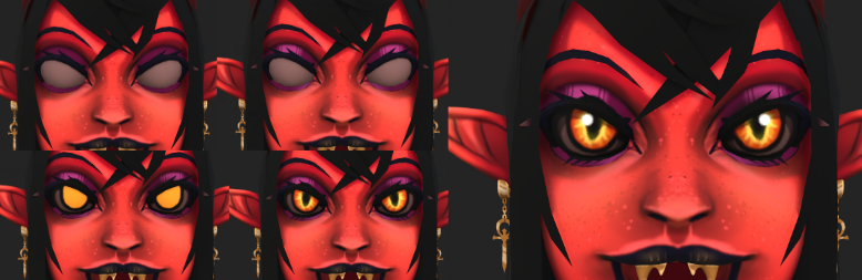
EYES
For the eyes, I started with a base color and added purple/magenta makeup for an evil, goth aesthetic. I used simple, streaky highlights to add depth to the eyelids. For the eyeballs, I chose a base of yellow, layered orange around the edges to create a "demon lizard" look, and added an opaque drop shadow under the eyelashes. I even added a little bit of emission to the bright yellow to help them glow.
WINGS
When texturing the wings, I wanted to lean into a demonic yet vibrant look. I added texture and shadow using downward strokes, then used a cracked brush to simulate a veiny appearance. I added hard highlights at the bottom to emphasize transparency and popped in some dark outlines to define the shapes.

HAIR
I decided to try hair cards for the first time, as I’ve always been fascinated by them. I used a hair brush with maximum flow to scribble in each strand, then used a soft brush to carve out where the light wouldn't hit as brightly. I used the smudge tool with a medium flow to blend the streaks at the edges, creating a softer look, then erased back into it to add texture. Finally, I added a slightly saturated tint to the highlights to give it a more stylized feel.

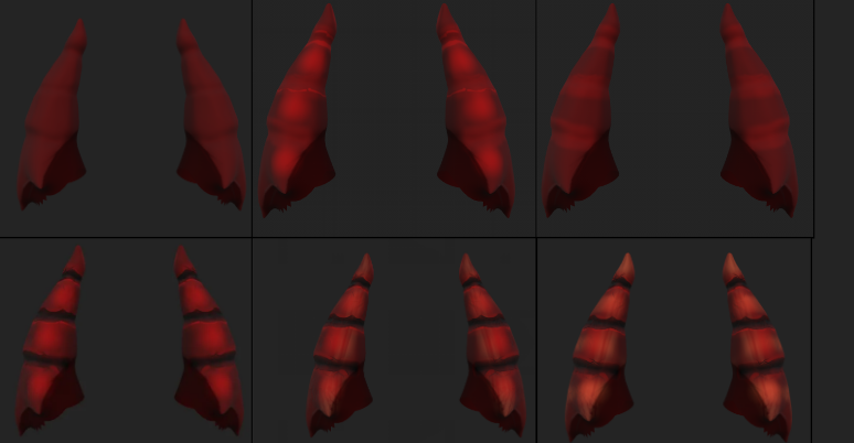
HORNS
For the horns, I started with a red base, then added saturated red highlights, exaggerating them further with a brighter tone. I used a brush with high contrast and a dark color to break up each section, adding "chips" and damage to make them look worn. Adding subtle oranges made them really pop. I didn't find the perfect reference for this, so I just went with the flow, but I’m very happy with how the chipped look turned out!
FINAL RESULT
After fine-tuning the textures, exporting to Unreal, rigging, posing, and setting up three-point lighting, I finally had my finished model! I'll spare you the technical details of the rigging and lighting process for now so we can focus on the texture work.


This was a super fun project, and it has confirmed my love for stylized art! I can't wait to practice this method further and develop my skills. Considering this is the first character I’ve sculpted and textured in this style, I’m very pleased with the results. I look forward to coming back to this project in a few years to see how much I’ve grown.
For my next and final post, I would like to offer some reflections on everything I’ve learned over the past year. Thank you all for following along with my art journey while I broadened my knowledge and passion for game art. I can't wait to see what I create next!


Comments